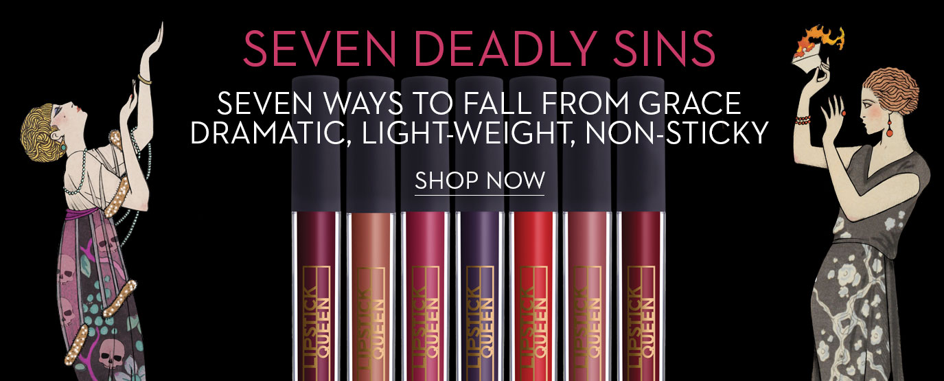
Lipstick Queen has just launched a collection of seven lip glosses named for the Seven Deadly Sins (Lust, Anger, Avarice, et al.). I’m old enough to remember Poppy King’s original Seven Deadly Sins, a series of matte lipsticks in shades that were very daring indeed for the mid-1990s. I tried a few of them at Barneys (the Short Hills location! long since gone!) back in the day.
Anyway, once again I’m compelled to note that Lipstick Queen has apparently asked its graphic designers to seek inspiration from art history or, in this case, from classic fashion illustration. The latest victim is Georges Barbier, a French illustrator best known for his work for Gazette du Bon Ton in the 1910s and 1920s.

Sometimes a few details have been altered, but otherwise, these are line-for-line “adaptations” of Barbier works. Here are two sources for the Seven Deadly Sins banner image.

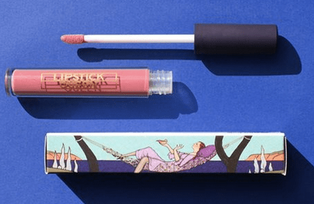
Here’s a photo of one of the boxes, via Lipstick Queen’s Facebook page, and the Barbier illustration that was its source.

I used to enjoy spotting the art references in the packaging for Lipstick Queen. At this point, however, I’m feeling less charmed by these “quotations” and more irritated. The original artists are never given credit, either on the packaging itself or in the press releases for these products (at least, not in releases I’ve received in the past–I haven’t been the copy for Seven Deadly Sins yet).
I’m not even sure what the copyright situation might be for these images; very possibly, they are all public domain by now, but wouldn’t it be nice to know where the LQ team found them? so that we can appreciate them fully and honestly?
I’ve loved this brand (in its various permutations) since the 1990s, as I mentioned above, so I’m feeling mixed emotions about this issue.
What do you think?
Feel free to re-read my posts about Lipstick Queen’s Belle Epoque, Frog Prince, and Ice Queen and their visual sources in art and illustration.

This is out of line, in my opinion. It’s one thing to be inspired, but these are too close to Barbier’s illustrations.
See…I didn’t mind the Erte pastiche *too* much, or even the Maxfield Parrish quotations…but this is pretty much line-for-line, with new colors, and the roses in a gown replaced by skulls, etc. This packaging is definitely not just inspired by Art Deco fashion illustration…it’s actively copying specific works. I’m glad I’m not being hypersensitive to this issue.
You definitely aren’t being too sensitive. This is such a blatant case. The more I look at it, the more I’m amazed that someone at the brand actually approved this design. The legal copyright issues aside, the lack of creativity is downright embarrassing.